Category Archives: Maps

Give Me Land Lots Of Land Under Starry Skies Above

Interactive maps are one of the greatest advances that the interwebs have brought to the masses.  The maps themselves can tell a story and the story can be fleshed out by various links and addenda.  And this is how you do an interactive map right:

http://invasionofamerica.ehistory.org

More of this, please.  The map shows all the takings of land from the Native Americans by the United States of America.  History is so depressing.  You can play the timeline to show year by year what portion of land was ceded to the U.S.  You can also click anywhere on the map and get a listing of all of the treaties and cessions that occurred for any piece of land.

How Old Is Your Building?

I love people with too much time on their hands.  They are the only reason why things like this map of Chicago homes color coded by when they were built ever see the light of day.  The data is by quarter century only, but you really get a good feel for how the city was built.  It would be a cool bonus feature if they would give each year a separate color.  Even better would be a time-lapse showing the buildings being built year by year.  You can also see the neighborhoods that were gentrified by identifying the areas where individual homes were rebuilt.  It’s pretty nifty.

Ride The Wave, Baby!

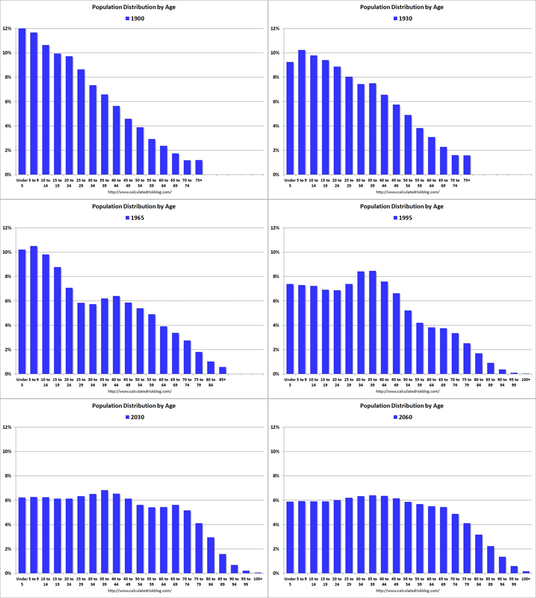
Calculated Risk is one of my favorite blogs.  Why?  Because while economics can be pretty boring, the applications of economics are absolutely fascinating.  Oh, and because of things like this:

PopDist


That’s the age distribution of the population of the United States from 1900 to 2060.  Check out that Baby Boomer wave!  Another cool thing is you can witness medical progress in this graph as well.  Notice how it goes from a max of 75+ to 85+ to 100+ as the brackets become statistically significant.  Also, look at how normalized the graph becomes after the wave.  This signifies the mostly flat birth rate in the U.S. that we currently have.

I’m trying to come up with an explanation as to why the Baby Boom wave kind of peters out near the end like a wave getting eaten away by an undertow.  The only thing that I can think of is general mortality slowly eats away at it.  That doesn’t seem like it could be the whole story though.  There has to be some other sort of statistical meaning behind it that I can not fathom.  Anyone care to explain?

The Golden Age Of Maps

Slate’s Future Tense writer Will Oremus argues that we are in the golden age of maps.  Click through for some mapy goodness.  Obviously, I agree since I was saying something similar just yesterday.

One thing he touches on that is worth pointing out is how much more easily accessible government data is with the mass acceptance of the Internet.  Whereas before it would be a tough slough through reams of paper data, now you can download everything and create a program to tear through gigabytes of information for free and process it any way you’d like to present it.  Given, this is still a lot of effort, but there are a lot of people willing to go through that effort.  And all you have to do is spend a little time on the Internet to see that hard work put to good use.

How Dangerous Is It Where You Live?

Check out these 4 maps of natural disasters.  Fires, tornadoes, earthquakes, and hurricanes.  (Oh my!)

My favorite is the map of the earthquakes.  You can see quite clearly where the tectonic plates meet.  It is amazing how far the continents have traveled from the plates and yet the shape of the continents still fits the lines of the tectonic plates.  Look at how active Europe is and how quiet Africa is.  I have to presume that is more because of the number of seismographs located in Europe than the dearth of earthquakes in Africa.

I think one of the greatest benefits of the Internet is the ability it gives to us not only to create great visualizations like in the above linked maps but to be able to share those visualizations with a huge audience.  These visualizations allow people the chance to see the world around them in different ways.  Ways that wouldn’t even have been thought of prior to the Internet.

It’s Care-Uh-Mel, You Ignorant Morans!

Anyone who says otherwise likes to kick dogs and drown kittens.

The language differences of America maps are making the rounds and they’re pretty cool.  Be sure to go to the original site for even more language difference maps.

For many things, I am not a normal Chicagoan (syrup = sir-up).  For others, I strive but fail to be Southern (I love “y’all” but can’t stop using “you guys”).  For others, I am at a complete loss (“bubbler” and “the devil is beating his wife”? WTF?).


Map Of The Year

Slate took data from NOAA and plotted every tornado that killed a person in the United States since 1950.  My only complaint about it is they morbidly focus only on tornadoes that killed people.  That, in itself, tells us nothing about tornadoes.  Still, though, you get a good feel for where tornadoes usually hit and where they don’t.

Notice how many of the tornadoes travel northeast.  There’s a reason for that.  Some of the best tornado forming weather occurs when the jet stream buckles and sends a pool of cold air south over the plains.  This allows warm, moist gulf air to build on the eastern side of the jet stream buckle.  Warm air meets cold air and boom!  Quick rising storm clouds form causing dangerous thunderstorms and sometimes tornadoes.  Those storms generally travel northeast because that’s where the jet stream is heading.  The answer, my friend, actually is blowing in the wind in this case!

All States Equal

Have you ever wondered what the United States would look like if all fifty states had the same population?  Wonder no longer!

How cool is that?  It’s very difficult to conceptualize how dense certain parts of the U.S. actually are and how sparse other parts are.  This map really makes it easier.  Look at how large the new state of Ogalalla is even though it contains Denver.

This map also shows how much room for population grown the U.S. has.  Places like the United Kingdom and Germany have 200 people per square kilometer.  The United States?  34.  Our population is around 315 million people right now.  If we had the population density of Germany or the U.K., we’d have 1.8 BILLION people.

Give me your tired, your poor,
Your huddled masses yearning to breathe free,
The wretched refuse of your teeming shore.
Send these, the homeless, tempest-tost to me,
I lift my lamp beside the golden door!

How segregated is your city?

This Flickr site would be pretty cool if it weren’t so depressing.  Who am I kidding? It’s REALLY cool despite being depressing.  Almost every major metropolitan area in the United States is incredibly segregated.

Partly, this is because like calls to like, sure, but that doesn’t tell the whole story.  I’ve seen white flight first hand.  I’ve seen gentrification (which is a polite word for rich white people kicking out poor colored people) first hand.  I’ve seen property taxes rise disproportionately higher in poor areas with little justification.  These issues can’t be blamed on like calling to like.

There are no easy answers to these problems.  Heck, I can’t even come up with good questions to address the problem.  All I know is we’ve now had 50+ years of cramming poor people into low rent high rises with disastrous results.  Most cities seem to realize this, but the answers are often tearing down the high rises and leaving the poor with no place to go but the suburbs.  This is not a step in the right direction.

We need local laws that require landlords to set aside 10% or so of their units for subsidized housing.  We need to stop being able to tax people out of their homes.  We need to repeal the property tax and find some other ways to raise the lost revenue.  We need to do…something.  Because those maps don’t just represent an awesome blend of statistical analysis and data visualization.  They also represent a serious social failure.